Industry

Beauty

Client

Condé Nast, Carol's Daughter

The Goal: High Reader Engagement

Main Project Image
Main Project Image
Main Project Image

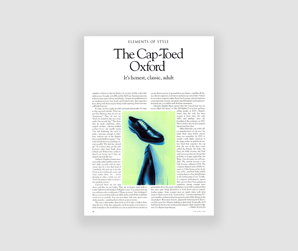
Working across Condé Nast's premium publications—GQ, W, Vogue, and Glamour—I faced the unique challenge of designing "front-of-book" high-impact, quick-read sections that set the tone for each issue

I respected each brand's DNA while injecting fresh visual energy. For GQ, I created layouts with masculine edge and bold typography. W magazine needed experimental, fashion-forward compositions. Vogue demanded sophistication and timeless elegance, while Glamour required accessible yet aspirational designs. Across all publications, I focused on creating "stop-and-look" moments through strategic composition, typography, and visual pacing. For direct mail, I applied editorial thinking to marketing materials, making subscription offers feel like content extensions rather than sales pieces.
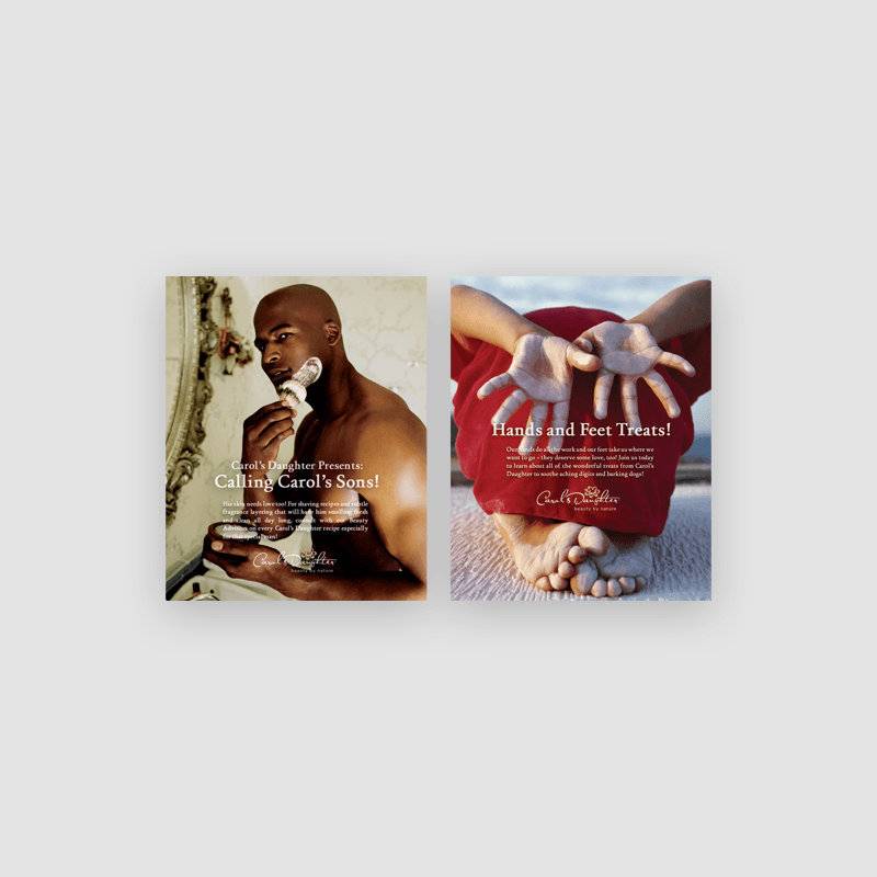
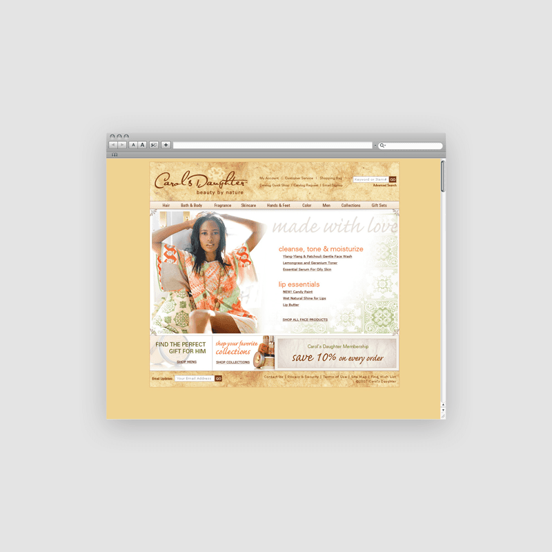
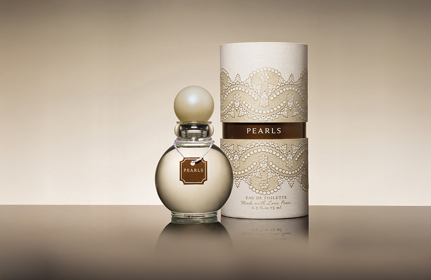
Large Project Gallery Image #1
Large Project Gallery Image #2

Project Gallery Image for 50% width of the screen #1
Project Gallery Image for 50% width of the screen #2
Large Project Gallery Image #3
Large Project Gallery Image #4

Carol's Daughter

For Carol's Daughter, one of Oprah's "Favorite Things" I was tasked with website refreshes, email blasts, store signage and displays, and new product packaging design.